The Volcanic Princess is a tale that has been fabled throughout the ages to inspire the light of a dying land. Her name was lost a long time ago but her title is renowned through the old world. It was said she was a innocent princess born to an overprotective King and Queen rulers of an immortal race, who saw their weakness in their creation. They begged a great sorcerer to craft a pendant of pure light to safeguard the good intentions of the land. Locked away from the horrors of the land the princess rarely was allowed to venture into the castle grounds, the threat of dark spirits and ill-doers were constant. The land began to decay into darkness until one day the King demanded the evacuation of his kingdom to the southern regions hoping to outrun the evil. On the convoy through the old mountain pass between the crossroads of dark and light, the front and back were separated. The King ordered his men to guard his Princess with their lives and told her to stay close to them as the light from her pendant would guide them to the correct path. Salvation was near but it was said that the Princess became influenced by the surrounding darkness and she became prone to her greatest fears. She chased a voice away from her company and was lost to the dark void of the mountain, the voices whispering her to journey to the end of the void. The Princess came to the end of the physical world, a gateway to another part of the mountain a gateway she did not realise once crossed would decide her fate for eternity. Forever entrapped within the mountain as it sprung to life, fire and ash skyrocketed to relieve the light from the dark and reality became distorted, a dream state. She became part of the mountain and its elements. The Volcanic Princess governs the space between the light and darkness of the old land and exists purely to balance the fate of all.
Thursday, 31 October 2013
Princess Influence Map
The second of my influence maps detailing the Princess to my secret lair, at this time I am still considering altering my character bio to create the overall portrayal of this space. I haven't decided if she is a cute and innocent girl and this is depicted in the environment or if she is a dark and sinister individual. My influence map reflects this statement, I used a range of keywords to explore accessories that may be props in this space and her actual nature. Perhaps she can manipulate her environment? I must decide soon.
Volcanic Influence Map
 My secret lair is full of diverse potential and I will be looking to dissect as much as possible from source material using key words. Trying to not be too generic in my working because when we think of Volcanic settings our minds seem to dive into caves, lava and ash environments when really for this project it demands further and deeper thought. So here is the Influence Map for Volcanic setting of my project, I have looked at a range of spaces from dark to light and cool to blazing hot. I should be looking further into perspective in the influence maps following this.
 Tuesday, 29 October 2013
Monday, 28 October 2013
Character 2 - Textures
Friday, 25 October 2013
Final Concepts
I present all three finished final pieces, I have to admit that I didn't tackle the development stages in the most convention method. I thought that the museum extract would present the most problems, expecially with the lighting, colour and perspective. I am not too sure about the fill of orange but I wanted to illustrate the sunset daunting over the space, also the flux of colours is supposed to convey the wonder that is taking place, the fact that this space is fascinating and holds wonder. The other two finals; The Workshop and Cave sections, work well I feel. I did take the cave from a undeveloped thumbnail and work out the perspective and redid the lighting. Overall I think I could say in my Cinematic Spaces Crit that I tried to show how the use of lighting and colour can bring emotion to a scene especially when it needs you to engage to expect in finding something out of the ordinary
Cave Development Colour
Working into my cave thumbnail increasing the detail and the luminosity of the piece by the aid of layers and multiple brushes. It is not yet finished to standard but I believe the perspective and lighting compliment each other. I want the space to be the main focus of the piece instead of the Time Traveler so I will be spending more time on getting the colours correct instead of adding too much detail into him as I do not want to blur the viewers attention
Thursday, 24 October 2013
Cave Idea
Taken from my digital thumbnails concerning the underground extract of my story I really liked the idea of having wide spaces allowing the light to pour into the darker environment, in the extract HG Wells details there being a vast network of tunnel systems that the Morlocks can move through, so I thought there could be a vast space where they all meet and perhaps add those industrial aspects conveyed through his descriptive writings, but I shall develop the idea further.
Workshop Development Colour
Working further into my Workshop concept artwork, I think it expresses a range of colours but I need to explore the use of darkening aspects and adding lighting to the piece. I will upload the finals once I have finished the development for all three conceptual pieces.
Wednesday, 23 October 2013
Workshop Pencil Final
Pencil reconstruction and build of one of my earlier thumbnails, added more detail here and there, and I thought of bringing in the addition of a desk in front of our perspective? So perhaps looking through a replica model of the Time Machine and other important components. I really like this perspective and much like the Museum piece I want lighting to fill the room from above or from the far window. Not decided yet.
Workshop Final Line Perspective
From my thumbnails I have decided to work upon for my final workshop perspective. I wanted to depict from the extract I was given obviously but I wanted the scene to have more than one level? I really liked the idea that the Time traveller would have a diverse library and also a study area built just off the 1st level of the library with a blackboard?? perhaps with the bookcases running the course of the space also. I look to work on the pencil study in photoshop in colour and lighting.
Museum Development Colour
I have started bringing in colour and more shading into my piece to bring forth depth and composition to the scene. this palette is a little more diverse than expected but when I decided to bring in the lighting from above the dome like roof and from below the paintings.
Museum Development
I have been working further into my piece, exploring the run down space trying to make the piece seem aged and part of the scene. I have been implementing some more lighting and the addition of the vines. I wanted there to be a build up of dust lingering in the air? so I shall be working into this further. Watch this space.
Tuesday, 22 October 2013
Museum Final Perspective
My finalized perspective was taken from one of my experimentations earlier during my thumbnails concerning the interior spaces of the Museum. I think that the lighting and colour must reflect the general feel of discovery and mystery from the novel also. And as the museum is still standing in the year 80,000AD it must seem dated. More development to be uploaded!
Museum scene development
A continuation of my designs for some of the interior spaces for the museum scene, I have tried to explore some new perspectives and spaces in these four. I am certain of a final design for this and I shall begin posting its final development.
Monday, 21 October 2013
Thumbnails 65-72
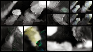
These thumbnails were all about the second extract from my book, the scene where the Time traveller ventures down into the dark caverns of the Morlocks in search of his machine. I enjoyed revisting the upper left piece with some colour comps, I feel that the hints of colour began to fill the space nicely and create a atmosphere of mystery and safe haven in the light and then slowly being lost into the blackness.
Thumbnails 48-64
A continuation of my digital thumbnails supporting my cinematic spaces project, i was exploring the colour and overall ambience from the cave and museum scenes. My favourites are the red and the bottom right because of the perspective and feel they emanate to the audience.
Friday, 18 October 2013
Thumbnails 14-47
Here are the thumbnails I have produced to show the development of my ideas feeding into my three key scenes. Due to difficulties with the Wacom Drivers I had to draw some of my thumbnails in traditional media, although if I am honest I find it easier to explore instead of the intricate settings on Photoshop. I used a pencil and a sharpie on my designs. I may revisit the muesuem piece later as a quick study.
Museum Design One Explorations
Taking the Mueseum design even further trying out different approaches to the space I need to illustrate for one of my final designs. I have experimented with perspectives and colour to discover the general feel and how I want to portay my own work. My favourite ones are the upper right image and the middle bottom. They stand out from the rest because of their perspective values and also the lighting of the scenes.
Museum Design One
Taken from my thumbnails earlier today I experimented with the design more by adding contrast, shadows and lighting. I spent about 30 minutes just rearranging the scene and I like the perspective of the piece also. I may play around with other simplistic perspective and designs next
Tuesday, 15 October 2013
One, Two and Three Point Perspectives
After the photoshop sessions with Jordan I did a quick drawing of the perspective angles just to show I have some knowledge.
UV Block Maya
The finshed output after finishing my Block tutorial,I found following it with ease and mapping seems easy to me. Looking forward to further experimentation soon :)
Monday, 14 October 2013
Lighting Part One - Lighting and Shadows (Tutorial)
Today we were introduced to some of the lighting techniques avaliable to us in Maya. We experiemented with a range of lighting effects some were simplistic in nature whilst others proved more advanced and tedious. It was all about Light placement so it was key to experiment and save images as we went along. I saved around thirty screenshots to archive this tutorial. More on Lighting and Shadows soon!
Texturing Part One - Common Shaders
I have completed the first part of the texturing series for the mini project 'Common Shaders'. It briefly introduces us to what kind of shaders we will come across throughout the duration of the course and highlights the best. The tutorial was easy to follow and I replicated the process in ease, I was most intrigued by the glass shader the most and I look forward to experimenting with this in the near future :)
Friday, 11 October 2013
Wednesday, 9 October 2013
Monday, 7 October 2013
Maya Tutorial Two
I have completed the second Maya tutorial, following the instructions were easy until I constructed the tongue. I had minor problems with the placement, density and overall bend. I enjoyed listening to the tutorial off the online blog instead of observing it being done within the scheduled tutorial last week. Overall I am pleased with my progress in Maya especially with the finish on the Eraser as it took me mere minutes to recreate from the tutorial! Next tutorial up soon!
Friday, 4 October 2013
Maya Tutorial One
I completed my introduction tutorial to Maya today and completed three different Eggcups comprised from using three methods; Polygon, NURBS and Subdivisions. The first one was straight forward to recreate and I was at ease with the tutorial. The second was a Curve that I followed the curvature of the Polygon Eggcups outline, the last one was tedious and I hated it. Ill obviously become more accustomed to using Subdivs but this was my attempt, expecting some good feedback! :)
Tuesday, 1 October 2013
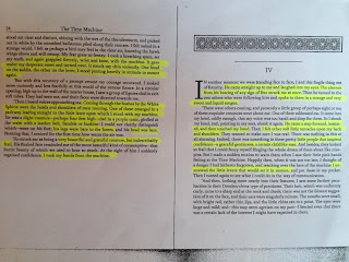
H.G. Wells 'Time Machine' Extract One Analysis
In the first extract we are introduced to the Time travellers workshop and study, extensive use of descriptive writing detailing all the little components that make up the scene. This is the first time the Time traveller has actually used the device so an obvious recording of the time (10'clock)is advised. He first travels from 10.01 to 15.30 in an instant and he describes Mrs Watchett as a blur of motion and even the snail blazing past on the floor. Interesting aspects that were followed up in the original film. This extract is vital to introducing the traveller, machine, workshop and the journey between A to B. I think from my mind map and highlighted analysis I can produce a piece for this extract. I am hoping to create a piece for each extract.
Summer Project Life-Form Turnarounds
I really favoured 'Billy the Dinosaur' probably due to the fact he represents a childhood interest of mine, I wanted to develop him further. I found that doing the front turnaround was alright but perhaps the placement of the feet could have been better, and also I recognised that the underbelly and the tail could produce a challenge once I was on the side on and back views. I completely forgot the use of proportion lines when completing these turnarounds, once I revisit character design I will be sure to highlight this to show my development from my mistake.
Summer Project Machine Turnarounds
You may recognise this particular character from earlier on in my thumbnails, I gave the 'Iron Giant' a side story similar to 'Bob's' saying he was his cousin. Well the Iron Giant would work on site at a construction yard assisting in the hard labour of his human counterparts, originally made by a russian scientist in the 80's he has now been decommissioned from service and placed in compulsory employment. The motherland has no use for robotics when they have Vodka. I should have added the proportion lines in so next time I will because for now I guess it looks okay but in high production I need to be more careful, even though it is a final I think it could have been presented better maybe on a different surface or change of scale.
Summer Project Drawings #2
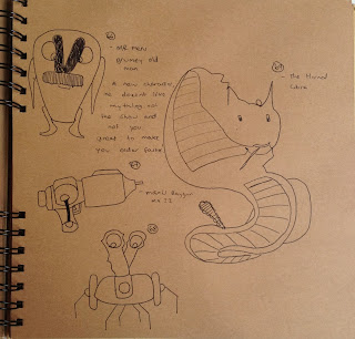
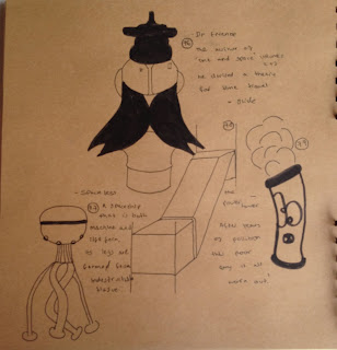
A continuation of the thumbnails I have produced for the Summer Project, all completed in the same style as the others. By this stage I felt more fluid with my drawings, experimenting away from the object list and more on random shapes and composing naturally. I actually found it easier to produce the more I worked up in the numbers, some designs were revisited but altered in some way to bring new energy to the design and try something new. I know that on the brief it stated we should work loosely and not rub anything out, but I took my time and thought about each illustration carefully before putting pen to paper to speak. After these drawings its time to present my final turnarounds I have completed.
Subscribe to:
Comments (Atom)


